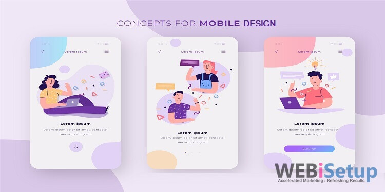
How to Optimize Your Mobile Design for Search?
Do people prefer mobile or computer?
This is a very common question that online business owners have, it helps them to decide whether they go with web design or mobile design. There are about 3 billion people who use smartphones to search for products and services while 1.3 billion people use computers. Now it is clear that you have to go for Mobile Web design to provide the best user experience.
To begin, check out these five tips that will make sure your mobile design is SEO-friendly. These are essential not only for success but also for sustainable success and are must-follows for any digital marketing agency helping companies optimize the mobile design for SEO.
The below points will show you the ways to optimize your website for mobile devices:
Verify with Google’s Mobile-Friendly Tool
It is a smart step to check your website with Google’s Mobile-Friendly Tool. Because it will help you to see how your website looks in a mobile-friendly manner. It is free to use, and any business can check how their website looks on the phone. You have to put the URL and click on the run option. You can also change few things in your web design, and it will fit with the Mobile Design. Don’t forget to check the speed of the website on your phone and how much time it takes to load.
- Select unique theme
It is not easy to choose the best WordPress theme for your website as you have to take care of many factors. Make sure the WordPress theme will be well optimized and does not harm your website. You can customize the theme according to the needs of your website. Always prefer the stylish and appealing look theme for your mobile. Make on-page content short and to the point, and don’t forget to have clear CTAs such as easy-to-find and clickable contact info, including phone number and address. This allows visitors to easily engage, which can help smoothen the flow to conversions.
- Trustworthy web host
Choose a trustworthy and reliable web host is the best decision you will ever make for your website. Because web host determines the speed and performance of your website. A good host will provide high speed to your mobile-friendly website.
- Escalate loading time
If you want to check the mobile speed time of your website, you can use Mobile Speed Test Tool. You have to put the URL of your website and click on the arrow button. The tool will show you the result that contains all the details regarding the mobile speed. Remember also that lightning-fast page speeds on mobile help with conversion and customer satisfaction. The average mobile website load times for bounced sessions were about 2.5 seconds slower than non-bounced sessions, according to Think with Google.
- Touch up your Pop-Ups
While making your website mobile-friendly, you must spend some time touching up the pop-ups. Make sure your mobile device has strategically planned pop-ups to grab the attention of the visitors. Pages that show intrusive interstitials provide a poor user experience, according to Google. This is why Google now penalizes businesses with mobile pop-ups, which was part of the January 10 algorithm update.
- Design for Big Fingers
Your mobile-first design should have touch screen navigation that is easily scrolled with fingers that are either too big or too small. Think about the size of a thumb and index finger, and make sure your mobile design caters to all for a smoother UX. The smoother the UX, the more engagement, which means the better the SEO.
- Titles & Meta Descriptions
Yes, SEOs know the importance of action-driven titles and meta descriptions that include target keywords for websites. Meta descriptions should also be shorter for a truly enhanced mobile experience.
Also, make sure all your contact forms are designed for mobile. This is a common mistake among many companies — even enterprise-level companies. Make sure all contact forms use HTML5 input types, which will automatically register the correct keyboard for mobile browsers, which have various on-screen keyboards for various types of data.
All these points contain the information to optimize your mobile design for search. The WEBiSteup provides the best Website and Mobile devices services, as they will customize the services according to your business needs. To know more about the WEBiSetup, you can use the customer support service. You can also make a consultation call to know the further process of making a website mobile-friendly.
---------------------------------------------------------------------
Have some more questions? or need a piece of expert advice? drop a line to us at hello@webisetup.com and our expert will take care of all of your queries.